Visualizaciones Impresionantes
Publicado el: 16 de Enero del 2021 - Jhonatan Montilla
En este artículo les enseñaremos como generar gráficos llamativos para la representación gráfica de sus datos a través de las librerías de Python: Matplotlib y Seaborn. Para este ejercicio utilizaremos un par de conjuntos de datos los cuales podrá descargar directamente desde nuestro repositorio.
- Carga de las librerías de Python necesarias.
import matplotlib.pyplot as plt
import numpy as np
import pandas as pd
import seaborn as sns
from bokeh.plotting import figure, output_file, show
Gráficos con librería de Python Matplotlib
- Carga del conjunto de datos de Netflix.
netflix_data = pd.read_csv('netflix_titles.csv')
netflix_data.head()
| show_id | type | title | director | cast | country | date_added | release_year | rating | duration | listed_in | description | |
|---|---|---|---|---|---|---|---|---|---|---|---|---|
| 0 | 81145628 | Movie | Norm of the North: King Sized Adventure | Richard Finn, Tim Maltby | Alan Marriott, Andrew Toth, Brian Dobson, Cole... | United States, India, South Korea, China | September 9, 2019 | 2019 | TV-PG | 90 min | Children & Family Movies, Comedies | Before planning an awesome wedding for his gra... |
| 1 | 80117401 | Movie | Jandino: Whatever it Takes | NaN | Jandino Asporaat | United Kingdom | September 9, 2016 | 2016 | TV-MA | 94 min | Stand-Up Comedy | Jandino Asporaat riffs on the challenges of ra... |
| 2 | 70234439 | TV Show | Transformers Prime | NaN | Peter Cullen, Sumalee Montano, Frank Welker, J... | United States | September 8, 2018 | 2013 | TV-Y7-FV | 1 Season | Kids' TV | With the help of three human allies, the Autob... |
| 3 | 80058654 | TV Show | Transformers: Robots in Disguise | NaN | Will Friedle, Darren Criss, Constance Zimmer, ... | United States | September 8, 2018 | 2016 | TV-Y7 | 1 Season | Kids' TV | When a prison ship crash unleashes hundreds of... |
| 4 | 80125979 | Movie | #realityhigh | Fernando Lebrija | Nesta Cooper, Kate Walsh, John Michael Higgins... | United States | September 8, 2017 | 2017 | TV-14 | 99 min | Comedies | When nerdy high schooler Dani finally attracts... |
- Conjunto de datos agrupado por tipo y año de lanzamiento, así como también, se reemplazan los valores faltantes con 0
n_data = netflix_data.groupby(['release_year', 'type'], as_index=False).show_id.count()
n_data.columns = ['release_year', 'type', 'count']
n_data_pivot = n_data.pivot(index='release_year', columns='type', values='count').reset_index()
n_data_pivot.fillna(0, inplace = True)
n_data_pivot.head()
| type | release_year | Movie | TV Show |
|---|---|---|---|
| 0 | 1925 | 0.0 | 1.0 |
| 1 | 1942 | 2.0 | 0.0 |
| 2 | 1943 | 3.0 | 0.0 |
| 3 | 1944 | 3.0 | 0.0 |
| 4 | 1945 | 3.0 | 0.0 |
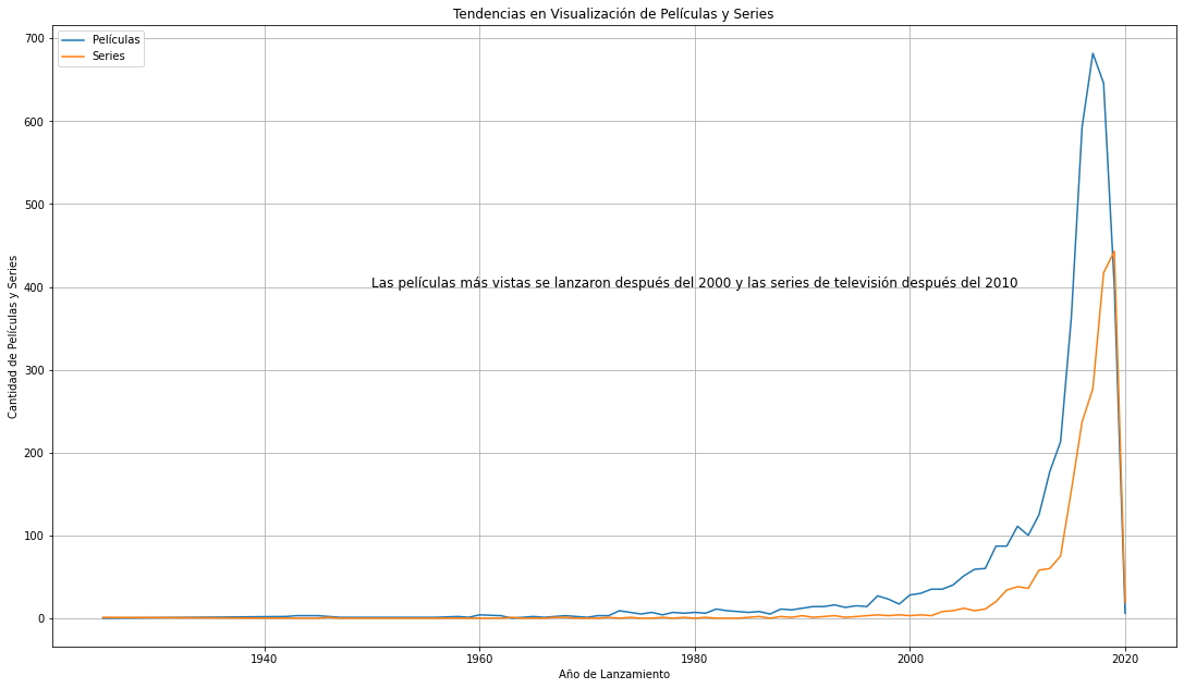
Gráfico de líneas con leyenda y notas.
fig, ax = plt.subplots()
ax.plot(n_data_pivot.release_year, n_data_pivot.Movie, label = "Películas")
ax.plot(n_data_pivot.release_year, n_data_pivot['TV Show'], label = "Series")
ax.set_ylabel("Cantidad de Películas y Series")
ax.set_xlabel("Año de Lanzamiento")
ax.set_title("Tendencias en Visualización de Películas y Series")
plt.text(x=1950, y=400, s=r"Las películas más vistas se lanzaron después del 2000 y las series de televisión después del 2010", fontsize = 12)
fig.set_size_inches(18.5, 10.5)
plt.grid()
ax.legend();
- Conjunto de datos agrupado por tipo y año en que agregó a la lista, así como también, se reemplazan los valores faltantes con 0
netflix_data['year_added'] = netflix_data['date_added'].str.slice(start=-4)
n_data_added = netflix_data.groupby(['year_added', 'type'], as_index=False).show_id.count()
n_data_added.columns = ['year_added', 'type', 'count']
n_data_added = n_data_added.pivot(index='year_added', columns='type', values='count').reset_index()
n_data_added.fillna(0, inplace = True)
n_data_added.head()
| type | year_added | Movie | TV Show |
|---|---|---|---|
| 0 | 2008 | 1.0 | 1.0 |
| 1 | 2009 | 2.0 | 0.0 |
| 2 | 2010 | 1.0 | 0.0 |
| 3 | 2011 | 13.0 | 0.0 |
| 4 | 2012 | 4.0 | 3.0 |
Gráfico de barras verticales con leyenda y etiquetas.
labels = n_data_added['year_added']
x = np.arange(len(labels))  # Ubicación de las etiquetas
width = 0.35  # Ancho de las barras
fig, ax = plt.subplots()
Movies_rects = ax.bar(x - width/2, n_data_added['Movie'], width, label='Películas') # Agrega color aquí
TVshows_rects = ax.bar(x + width/2, n_data_added['TV Show'], width, label='Series')
# Agrega texto para etiquetas, título, configure el tamaño del gráfico.
ax.set_xlabel("Año en que agregó a Netflix")
ax.set_ylabel("Cantidad de Películas o Series de Tv")
ax.set_title("Cantidad de Películas y Series de Televisión agregadas al catálogo de Netflix")
ax.set_xticks(x)
ax.set_xticklabels(labels)
fig.set_size_inches(18.5, 10.5)
plt.rcParams.update({'font.size': 15})
ax.legend()
 # Función para generar las etiquetas en la parte superior de las barras.
def gen_label(rects):
    for rect in rects:
        height = rect.get_height()
        ax.annotate('{}'.format(height),
                    xy=(rect.get_x() + rect.get_width() / 2, height),
                    xytext=(0, 3),  # Desplazamiento vertical de 3 puntos
                    textcoords="offset points",
                    ha='center', va='bottom')
gen_label(Movies_rects)
gen_label(TVshows_rects)
fig.tight_layout()
plt.show()
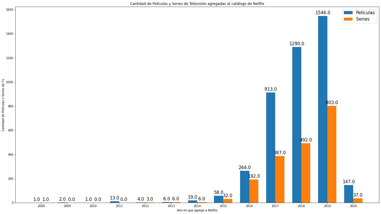
Gráfico de barras horizontales con leyenda.
data = pd.DataFrame(dict(Year = n_data_added['year_added'],
                       Movie = n_data_added['Movie'], TVshow=n_data_added['TV Show']))
ind = np.arange(len(data))
width = 0.4
fig1, ax1 = plt.subplots()
ax1.barh(ind, data.Movie, width, color='red', label="Películas")
ax1.barh(ind + width, data.TVshow, width, color='green', label="Series")
ax1.set(yticks=ind + width, yticklabels=data.Year, ylim=[2*width - 1, len(data)])
ax1.set_ylabel("Año en que agregó a Netflix")
ax1.set_xlabel("Cantidad de Películas o Series de Tv")
ax1.set_title("Cantidad de Películas y Series de Televisión \nagregadas al catálogo de Netflix")
ax1.legend()
fig1.set_size_inches(10, 10)
plt.show()
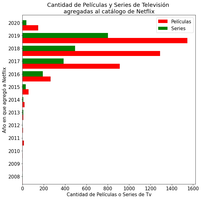
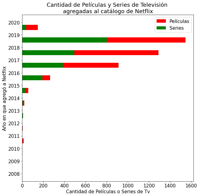
Gráfico de barras apiladas con leyenda.
data = pd.DataFrame(dict(Year = n_data_added['year_added'],
                       Movie = n_data_added['Movie'], TVshow=n_data_added['TV Show']))
ind = np.arange(len(data))
width = 0.4
fig1, ax1 = plt.subplots()
ax1.barh(ind, data.Movie, width, color='red', label="Películas")
ax1.barh(ind, data.TVshow, width, color='green', label="Series")
ax1.set(yticks=ind + width, yticklabels=data.Year, ylim=[2*width - 1, len(data)])
ax1.set_ylabel("Año en que agregó a Netflix")
ax1.set_xlabel("Cantidad de Películas o Series de Tv")
ax1.set_title("Cantidad de Películas y Series de Televisión \nagregadas al catálogo de Netflix")
ax1.legend()
fig1.set_size_inches(10, 10)
plt.show()
- Para el próximo caso será necesario agregar en el conjunto de datos una columna con los números del total de películas y series de televisión juntos.
n_data_added['Total'] = n_data_added['Movie'] + n_data_added['TV Show']
n_data_added_flt = n_data_added[-4:] # Para seleccionar solo las últimas filas
n_data_added_flt = n_data_added_flt.reset_index(drop=True) # Para restablecer el índice
n_data_added_flt.head()
| type | year_added | Movie | TV Show | Total |
|---|---|---|---|---|
| 0 | 2017 | 913.0 | 387.0 | 1300.0 |
| 1 | 2018 | 1290.0 | 492.0 | 1782.0 |
| 2 | 2019 | 1546.0 | 803.0 | 2349.0 |
| 3 | 2020 | 147.0 | 37.0 | 184.0 |
Gráfico Circular tipo Torta con etiquetas porcentuales.
labels = n_data_added_flt['year_added']
sizes = n_data_added_flt['Total']
explode = (0, 0.1, 0, 0)  # Separa la segunda rebanada (año 2018)
fig2, ax2 = plt.subplots()
ax2.pie(sizes, explode=explode, labels=labels, autopct='%1.1f%%',
        shadow=True, startangle=90)
ax2.axis('equal')  # Relación de aspecto garantiza que la torta se dibuje como un círculo.
plt.show()
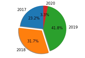
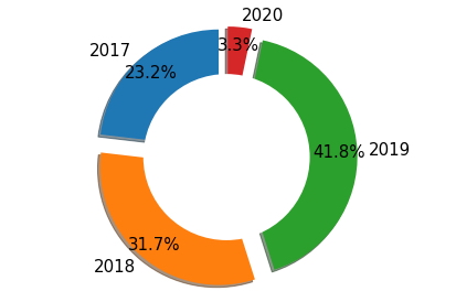
Gráfico Circular tipo Anillo con etiquetas porcentuales
labels = n_data_added_flt['year_added']
sizes = n_data_added_flt['Total']
explode = (0.1, 0.1, 0.1, 0.1)  # Separa todas las rebanadas
fig2, ax2 = plt.subplots()
ax2.pie(sizes, explode=explode, labels=labels, autopct='%1.1f%%',
        shadow=True, startangle=90, pctdistance=0.85) # Ajusta la ubicación de la fuente
# Dibuja un círculo y convierte el gráfico circular un gráfico de anillos
centre_circle = plt.Circle((0,0),0.70,fc='white')
fig2 = plt.gcf()
fig2.gca().add_artist(centre_circle)
# Relación de aspecto igual garantiza que la torta se dibuja como un círculo
ax2.axis('equal')
plt.tight_layout()
plt.show()
Gráficos con librería de Python Seaborn
- Carga del segundo conjunto de datos, Registro de Ataques Cardíacos.
heart_failure_data = pd.read_csv('heart_failure_clinical_records_dataset.csv')
heart_failure_data.head()
| age | anaemia | creatinine_phosphokinase | diabetes | ejection_fraction | high_blood_pressure | platelets | serum_creatinine | serum_sodium | sex | smoking | time | death_event | |
|---|---|---|---|---|---|---|---|---|---|---|---|---|---|
| 0 | 75.0 | 0 | 582 | 0 | 20 | 1 | 265000.00 | 1.9 | 130 | 1 | 0 | 4 | 1 |
| 1 | 55.0 | 0 | 7861 | 0 | 38 | 0 | 263358.03 | 1.1 | 136 | 1 | 0 | 6 | 1 |
| 2 | 65.0 | 0 | 146 | 0 | 20 | 0 | 162000.00 | 1.3 | 129 | 1 | 1 | 7 | 1 |
| 3 | 50.0 | 1 | 111 | 0 | 20 | 0 | 210000.00 | 1.9 | 137 | 1 | 0 | 7 | 1 |
| 4 | 65.0 | 1 | 160 | 1 | 20 | 0 | 327000.00 | 2.7 | 116 | 0 | 0 | 8 | 1 |
- Se agrupan los datos por edad y cantidad de decesos.
agg_data = heart_failure_data.groupby(['age', 'death_event'], as_index=False).ejection_fraction.count()
agg_data.columns = ['Age', 'death_event', 'Count']
agg_data.head()
| Age | death_event | Count | |
|---|---|---|---|
| 0 | 40.0 | 0 | 7 |
| 1 | 41.0 | 0 | 1 |
| 2 | 42.0 | 0 | 6 |
| 3 | 42.0 | 1 | 1 |
| 4 | 43.0 | 0 | 1 |
Gráfico de líneas con leyenda
sns.relplot(x="Age", y="Count",
            hue="death_event" , aspect=16/9,
            kind="line", data=agg_data);
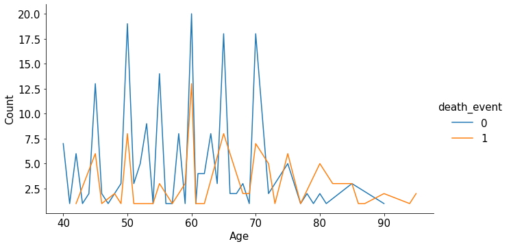
Gráfico de Dispersión con leyenda tipo 1
sns.relplot(x="serum_creatinine", y="ejection_fraction",
            hue="death_event", kind="scatter",
            data=heart_failure_data, aspect=16/9);
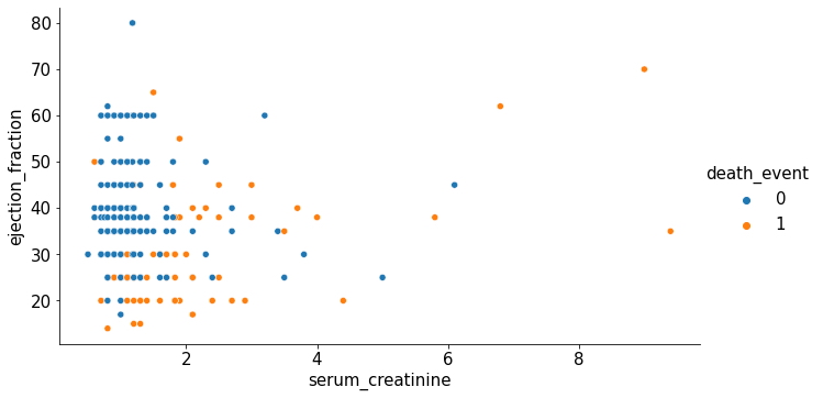
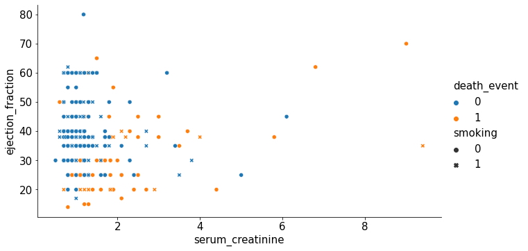
Gráfico de Dispersión con leyenda tipo 2
sns.relplot(x="serum_creatinine", y="ejection_fraction",
            hue="death_event", kind="scatter",
            style="smoking",
            data=heart_failure_data, aspect=16/9);
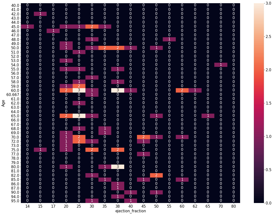
- Se prepara el conjunto de datos para el siguiente caso, gráfico de mapa de calor.
agg_data2 = heart_failure_data.groupby(['age', 'ejection_fraction'], as_index=False).death_event.sum()
agg_data2.columns = ['Age', 'ejection_fraction', 'Deaths']
agg_data2_p = agg_data2.pivot(index='Age', columns='ejection_fraction', values='Deaths')
agg_data2_p.fillna(0, inplace=True)
agg_data2_p.head(10)
| ejection_fraction | 14 | 15 | 17 | 20 | 25 | 30 | 35 | 38 | 40 | 45 | 50 | 55 | 60 | 62 | 65 | 70 | 80 |
|---|---|---|---|---|---|---|---|---|---|---|---|---|---|---|---|---|---|
| Age | |||||||||||||||||
| 40.0 | 0.0 | 0.0 | 0.0 | 0.0 | 0.0 | 0.0 | 0.0 | 0.0 | 0.0 | 0.0 | 0.0 | 0.0 | 0.0 | 0.0 | 0.0 | 0.0 | 0.0 |
| 41.0 | 0.0 | 0.0 | 0.0 | 0.0 | 0.0 | 0.0 | 0.0 | 0.0 | 0.0 | 0.0 | 0.0 | 0.0 | 0.0 | 0.0 | 0.0 | 0.0 | 0.0 |
| 42.0 | 0.0 | 1.0 | 0.0 | 0.0 | 0.0 | 0.0 | 0.0 | 0.0 | 0.0 | 0.0 | 0.0 | 0.0 | 0.0 | 0.0 | 0.0 | 0.0 | 0.0 |
| 43.0 | 0.0 | 0.0 | 0.0 | 0.0 | 0.0 | 0.0 | 0.0 | 0.0 | 0.0 | 0.0 | 0.0 | 0.0 | 0.0 | 0.0 | 0.0 | 0.0 | 0.0 |
| 44.0 | 0.0 | 0.0 | 0.0 | 0.0 | 0.0 | 0.0 | 0.0 | 0.0 | 0.0 | 0.0 | 0.0 | 0.0 | 0.0 | 0.0 | 0.0 | 0.0 | 0.0 |
| 45.0 | 1.0 | 0.0 | 0.0 | 1.0 | 1.0 | 2.0 | 1.0 | 0.0 | 0.0 | 0.0 | 0.0 | 0.0 | 0.0 | 0.0 | 0.0 | 0.0 | 0.0 |
| 46.0 | 0.0 | 0.0 | 1.0 | 0.0 | 0.0 | 0.0 | 0.0 | 0.0 | 0.0 | 0.0 | 0.0 | 0.0 | 0.0 | 0.0 | 0.0 | 0.0 | 0.0 |
| 47.0 | 0.0 | 0.0 | 0.0 | 0.0 | 0.0 | 0.0 | 0.0 | 0.0 | 0.0 | 0.0 | 0.0 | 0.0 | 0.0 | 0.0 | 0.0 | 0.0 | 0.0 |
| 48.0 | 0.0 | 0.0 | 0.0 | 0.0 | 0.0 | 1.0 | 0.0 | 0.0 | 0.0 | 0.0 | 0.0 | 1.0 | 0.0 | 0.0 | 0.0 | 0.0 | 0.0 |
| 49.0 | 0.0 | 0.0 | 0.0 | 1.0 | 0.0 | 0.0 | 0.0 | 0.0 | 0.0 | 0.0 | 0.0 | 0.0 | 0.0 | 0.0 | 0.0 | 0.0 | 0.0 |
Gráfico tipo Mapa de Calor
plt.subplots(figsize=(20,15))
sns.heatmap(agg_data2_p, annot=True)
plt.show()
- Se prepara una muestra del conjunto de datos para el siguiente caso.
subset = heart_failure_data.iloc[:,[0,1,2,3,4]]
subset.head()
| age | anaemia | creatinine_phosphokinase | diabetes | ejection_fraction | |
|---|---|---|---|---|---|
| 0 | 75.0 | 0 | 582 | 0 | 20 |
| 1 | 55.0 | 0 | 7861 | 0 | 38 |
| 2 | 65.0 | 0 | 146 | 0 | 20 |
| 3 | 50.0 | 1 | 111 | 0 | 20 |
| 4 | 65.0 | 1 | 160 | 1 | 20 |
Gráficos Mixtos de Parcelas (Histogramas y Dispersión)
- Este tipo de gráficos es ideal para visualizar gráficamente la distribución de los datos y sus correlaciones de variables de un conjunto de datos.
sns.pairplot(subset);
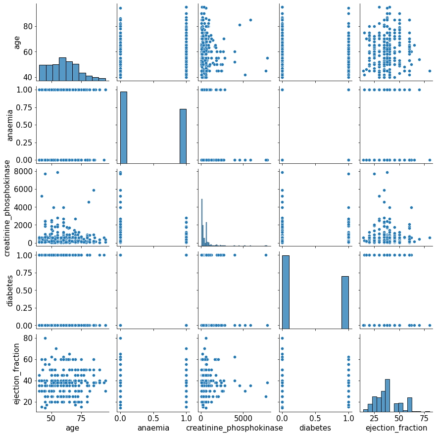
Gráfico de Dispersión Dinámico
- Este tipo de gráficos es ideal para visualizar dinámicamente la distribución de los datos a través del uso de controles.
p = figure(title = "Edad vs Cantidad de Rechazos")
p.xaxis.axis_label = "Edad"
p.yaxis.axis_label = "Cantidad de Rechazos"
p.circle(agg_data2["Age"], agg_data2["ejection_fraction"],
         fill_alpha=0.2, size=10)
output_file("test.html", title="Example")
show(p);
- Para visualizar el gráfico generado con el código anterior hacer clic Aquí.
Esperamos que esta publicación sea un aporte para realizar representaciones gráficas más llamativas de sus datos, en caso de que quieran profundizar más en cada una de las librerías de gráficos utilizadas en este artículo les invitamos a revisar la documentación disponible en la web para cada una de estas.