Análisis Exploratorio de Datos (EDA) con Técnicas de Visualización
Publicado el: 10 de Febrero del 2021 - Jhonatan Montilla
En este artículo mostraremos el proceso Exploratory Data Analysis (EDA) con técnicas de visualización para analizar si una muestra de agua con cierto contenido es potable o no. Este proceso se implementa en el lenguaje de programación Python. Puede descargar el conjunto de datos haciendo clic aquí.
Importar Módulos
import pandas as pd
import numpy as np
from collections import Counter
import seaborn as sns
import matplotlib.pyplot as plt
from matplotlib.patches import Rectangle
import plotly.express as px
import plotly.graph_objects as go
from plotly.subplots import make_subplots
import missingno as msno
from warnings import filterwarnings
Configuración de Paleta de Colores
colors = ['#06344d','#00b2ff']
sns.set(palette=colors, font='Serif', style='white', rc={'axes.facecolor':'#f1f1f1', 'figure.facecolor':'#f1f1f1'})
sns.palplot(colors)
colors_blue = ["#06344d", "#1E90FF", '#00b2ff', '#51C4D3', '#B4DBE9']
colors_dark = ["#1F1F1F", "#313131", '#636363', '#AEAEAE', '#DADADA']
sns.palplot(colors_blue)
sns.palplot(colors_dark)
Carga del Conjunto de Datos
data = pd.read_csv("water_potability.csv")
data.head()
| ph | Hardness | Solids | Chloramines | Sulfate | Conductivity | Organic_carbon | Trihalomethanes | Turbidity | Potability | |
|---|---|---|---|---|---|---|---|---|---|---|
| 0 | NaN | 204.890455 | 20791.318981 | 7.300212 | 368.516441 | 564.308654 | 10.379783 | 86.990970 | 2.963135 | 0 |
| 1 | 3.716080 | 129.422921 | 18630.057858 | 6.635246 | NaN | 592.885359 | 15.180013 | 56.329076 | 4.500656 | 0 |
| 2 | 8.099124 | 224.236259 | 19909.541732 | 9.275884 | NaN | 418.606213 | 16.868637 | 66.420093 | 3.055934 | 0 |
| 3 | 8.316766 | 214.373394 | 22018.417441 | 8.059332 | 356.886136 | 363.266516 | 18.436524 | 100.341674 | 4.628771 | 0 |
| 4 | 9.092223 | 181.101509 | 17978.986339 | 6.546600 | 310.135738 | 398.410813 | 11.558279 | 31.997993 | 4.075075 | 0 |
En la tabla se puede ver que la columna de Potabilidad es una Etiqueta (variable a predecir) y las otras columnas son Características (variable a predecir). La columna de Potabilidad tiene dos valores, a saber, 0 (no potable) y 1 (potable). Por lo tanto, las columnas de características se convierten en parámetros para determinar si la muestra de agua es potable (1) o no potable (0). Al observar el conjunto de datos, este es un tipo de tarea de aprendizaje supervisado en forma de predicción de categoría.
Tipo de Datos
data.info()
<class 'pandas.core.frame.DataFrame'>
RangeIndex: 3276 entries, 0 to 3275
Data columns (total 10 columns):
 #   Column           Non-Null Count  Dtype
---  ------           --------------  -----
 0   ph               2785 non-null   float64
 1   Hardness         3276 non-null   float64
 2   Solids           3276 non-null   float64
 3   Chloramines      3276 non-null   float64
 4   Sulfate          2495 non-null   float64
 5   Conductivity     3276 non-null   float64
 6   Organic_carbon   3276 non-null   float64
 7   Trihalomethanes  3114 non-null   float64
 8   Turbidity        3276 non-null   float64
 9   Potability       3276 non-null   int64
dtypes: float64(9), int64(1)
memory usage: 256.1 KB
Los datos constan de 3276 filas y 10 columnas. Además, el tipo de datos de la variable Potabilidad es entero. Cambiaremos el tipo de datos de dicha variable a categórica.
data['Potability'] = data['Potability'].astype('category')
data.info()
<class 'pandas.core.frame.DataFrame'>
RangeIndex: 3276 entries, 0 to 3275
Data columns (total 10 columns):
 #   Column           Non-Null Count  Dtype
---  ------           --------------  -----
 0   ph               2785 non-null   float64
 1   Hardness         3276 non-null   float64
 2   Solids           3276 non-null   float64
 3   Chloramines      3276 non-null   float64
 4   Sulfate          2495 non-null   float64
 5   Conductivity     3276 non-null   float64
 6   Organic_carbon   3276 non-null   float64
 7   Trihalomethanes  3114 non-null   float64
 8   Turbidity        3276 non-null   float64
 9   Potability       3276 non-null   category
dtypes: category(1), float64(9)
memory usage: 233.8 KB
Ahora, el tipo de datos de la variable Potabilidad son categorías.
Además, a partir de la información sobre el método .info() anterior, se muestra que
hay varias columnas (pH, sulfato y trihalometanos) que tienen menos filas que el conjunto de
datos (<3276). Esto significa que hay valores de datos vacíos en estas columnas. Se procede
a verificar la cantidad de valores pérdidos a través de una visualización gráfica.
Comprobación de Valores Perdidos
nan_scratch = msno.matrix(data, color = [0, 0.6, 0.7])
nan_scratch;
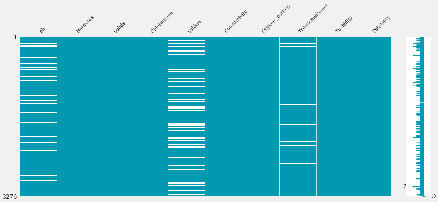
- De la matriz anterior, la columna Sulfato indica el NaN más significativo (valores perdidos). Visualizaremos gráficamente la cuantificación de estos a través de un mapa de calor.
plt.title('Valores faltantes por columna\n')
nan_data = data.isna().sum().sort_values(ascending = False).to_frame()
sns.heatmap(nan_data, annot = True, fmt = 'd', cmap = colors_blue);
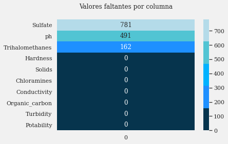
La variable Potabilidad como Etiqueta no tiene un valores perdidos, por lo que no será necesario imputarla. Ahora veamos la comparación de la cantidad de muestras de agua en el conjunto de datos que son seguras y no seguras para beber.
Comparación de Potabilidad del Agua
df= pd.DataFrame(data['Potability'].value_counts())

fig = px.pie(df,values = 'Potability',
             names = ['Not Potable','Potable'],
             hole = 0.4,
             opacity = 0.9,
             color_discrete_sequence = [colors[0],colors[1]],
             labels = {'label':'Potability','Potability':'No. Of Samples'})

fig.add_annotation(text = 'Water<br>Potabiliy',
                   x = 0.5,
                   y = 0.5,
                   showarrow = False,
                   font_size = 14,
                   opacity = 0.7,
                   font_family = 'Gravitas One')

fig.update_layout(font_family = 'Gravitas One',
                  title = dict(text = 'Comparación de muestras potables y no potables',
                               x = 0.5,
                               y = 0.98,
                               font = dict(color = colors_blue[0],
                                           size = 20)),
                  legend = dict(x = 0.37,
                                y = -0.05,
                                orientation = 'h',
                                traceorder = 'reversed'),
                  hoverlabel = dict(bgcolor = 'white'))

fig.update_traces(textposition = 'outside', textinfo = 'percent+label')

# Gráfico #

fig = plt.figure(figsize = (10,6))
ax = sns.countplot(data['Potability'], order = data['Potability'].value_counts().index)

for i in ax.patches:
    ax.text(x = i.get_x() + i.get_width() / 2,
            y = i.get_height() / 7,
            s = f"{np.round(i.get_height() / len(data) * 100,0)}%",
            ha = 'center', size = 50, weight = 'bold', rotation = 90, color = 'white')

for p in ax.patches:
    ax.annotate(format(p.get_height(), '.0f'),
                    (p.get_x() + p.get_width() / 2., p.get_height()),
                    ha = 'center',
                    va = 'center',
                    xytext = (0, 10),
                    textcoords = 'offset points')

plt.title("Comparación de muestras potables y no potables \n",
          size = 15,
          weight = 'bold')

plt.annotate(text = "Agua no segura para consumo humano",
             xytext = (0.5,1790),
             xy = (0.2,1250),
             arrowprops = dict(arrowstyle = "->",
                               color = 'blue',
                               connectionstyle = "angle3, angleA = 0, angleB = 90"),
             color = 'black')

plt.annotate(text = "Agua potable para consumo humano",
             xytext = (0.8,1600),
             xy = (1.2,1000),
             arrowprops = dict(arrowstyle = "->", color = 'blue',
                               connectionstyle = "angle3,angleA=0,angleB=90"),
             color = 'black')

sns.despine(right = True,
            top = True,
            left = True)
ax.axes.yaxis.set_visible(False)
plt.setp(ax)
plt.show();
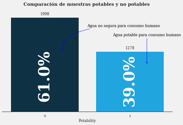
Se puede observar que la cantidad de agua que es segura (1) para beber es menor que la que no es segura (0).
- 0: 61%
- 1: 39%
Correlación de Variables
plt.figure(figsize=(16,12))
sns.heatmap(data.corr(), annot=True, cmap = colors_blue)
plt.title('Correlación de Variables\n', weight='bold');
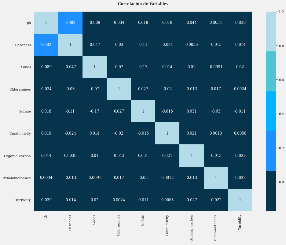
Valores negativos significan una correlación negativa, por ejemplo, cuando el valor de otra columna es más alto, hace que esa columna tenga un valor más bajo. La mayoría de las variables tienen una correlación muy baja con respecto a las otras, excepto las variables de pH y Dureza. Esto se debe a varios factores, uno de los cuales es el valor del rango de datos en cada variable que es significativamente diferente. Entonces se necesita un proceso de normalización.
Comprobación de la Distribución de Datos
Las características que afectan si el agua es apta para el consumo tienen límites que han sido estandarizados por la OMS. Limitemos cada función según la información de Google.
# crea un límite de aprobación para cada función en función de los datos disponibles en la búsqueda de Google
col = data.columns[0:9].to_list()
min_val = [6.5,60,500,0,3,200,0,0,0]
max_val = [8.5,120,1000,4,250,400,10,80,5]
limit = pd.DataFrame(data = [min_val, max_val], columns = col)
int_cols = data.select_dtypes(exclude = ['category']).columns.to_list()
fig, ax = plt.subplots(nrows = 3,
                       ncols = 3,
                       figsize = (15,15),
                       constrained_layout = True)
plt.suptitle("Distribución de características por clase de Potabilidad y límite aprobado",
             size = 20,
             weight = 'bold')
ax = ax.flatten()
for x, i in enumerate(int_cols):
    sns.kdeplot(data = data,
                x = i,
                hue = 'Potability',
                ax = ax[x],
                fill = True,
                multiple = 'stack',
                alpha = 0.5,
                linewidth = 0)
    l,k = limit.iloc[:,x]
    ax[x].add_patch(Rectangle(xy = (l,0),
                              width = k - l,
                              height = 1,
                              alpha = 0.5))
    for s in ['left','right','top','bottom']:
        ax[x].spines[s].set_visible(False)
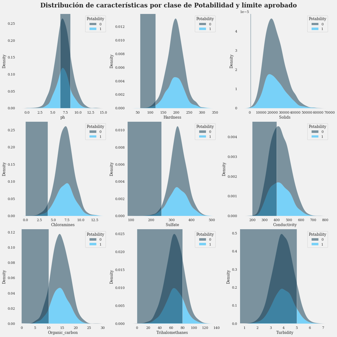
- Se puede observar que la distribución de la muestra de agua que no es potable es mayor que la de la potable en las columnas de Trihalometanos, Conductividad y Turbidez. En la columna de sólidos casi nada. Veamos con más detalle.
fig = px.histogram(data,x = 'ph', y = Counter(data['ph']), color = 'Potability', template = 'plotly_white',
                   marginal = 'box', opacity = 0.7, nbins = 100, color_discrete_sequence = [colors[0], colors[1]],
                   barmode = 'group', histfunc = 'count')
fig.add_vline(x = 6.5, line_width = 1, line_color = colors_dark[1], line_dash = 'dot', opacity = 0.7)
fig.add_vline(x = 8.5, line_width = 1, line_color = colors_dark[1], line_dash = 'dot', opacity = 0.7)
fig.add_annotation(text = "< 6.5 es demasiado ácido para beber <br> (no potable según el estándar de la OMS)",
                   x = 3, y = 70, showarrow = False, font_size = 15)
fig.add_annotation(text = "> 8.5 es demasiado básico para beber <br> (no potable según el estándar de la OMS)",
                   x = 11, y = 70, showarrow = False, font_size = 15)
fig.update_layout(font_family = 'Gravitas One', title = dict(text = "Distribución de pH",
                               x = 0.5, y = 0.95, font = dict(color = colors_blue[0], size = 20)),
                  xaxis_title_text = "Nivel de pH", yaxis_title_text = 'Cantidad',
                  legend = dict(x = 1, y = 0.96, bordercolor = colors_dark[4], borderwidth = 0,
                                tracegroupgap = 5), bargap = 0.3,)
fig.show();
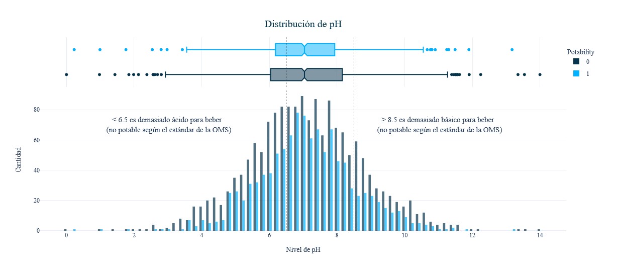
fig = px.histogram(data,x = 'Hardness', y = Counter(data['Hardness']), color = 'Potability', template = 'plotly_white',
                   marginal = 'box', opacity = 0.7, nbins = 100, color_discrete_sequence = [colors[0], colors[1]],
                   barmode = 'group', histfunc = 'count')
fig.add_vline(x = 120, line_width = 1, line_color = colors_dark[1], line_dash = 'dot', opacity=0.7)
fig.add_vline(x = 180, line_width = 1, line_color = colors_dark[1], line_dash = 'dot', opacity = 0.7)
fig.add_vline(x = 60, line_width = 1, line_color = colors_dark[1], line_dash = 'dot', opacity = 0.7)
fig.add_annotation(text = "< 60 mg / L <br> se considera <br> suave", x = 50, y = 130, showarrow = False, font_size = 12)
fig.add_annotation(text = "Entre 60 - 120 <br> (mg / L) es moderadamente duro", x = 85, y = 130, showarrow = False, font_size = 12)
fig.add_annotation(text = "Entre 120 - 180 (mg / L) <br> se considera duro", x = 150, y = 130, showarrow = False, font_size = 12)
fig.add_annotation(text = "> 180 mg / L se considera muy duro", x = 230, y = 130, showarrow = False, font_size = 12)
fig.update_layout(font_family = 'Gravitas One', title = dict(text = "Distribución de dureza", x = 0.53, y = 0.95,
                                                             font = dict(color = colors_dark[2], size = 20)),
                  xaxis_title_text = 'Dureza (mg/L)', yaxis_title_text = 'Cantidad', legend = dict(x = 1,
                                y = 0.96, bordercolor = colors_dark[4], borderwidth = 0,
                                tracegroupgap = 5), bargap = 0.3,)
fig.show();
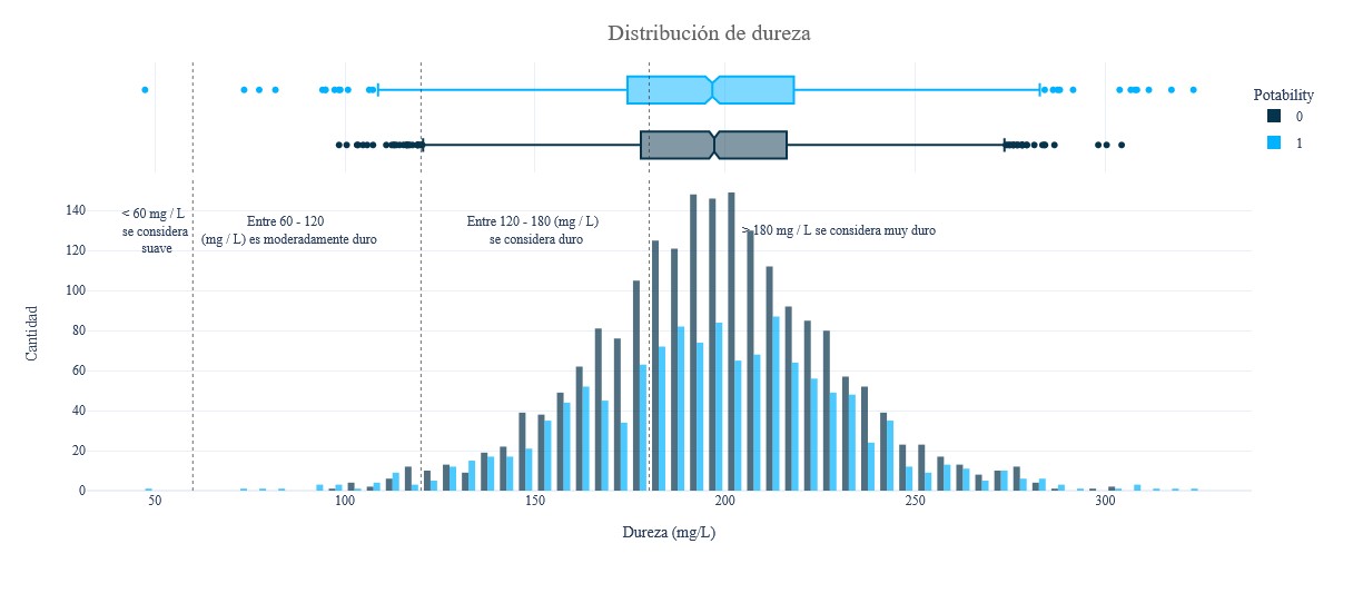
fig = px.histogram(data, x = 'Solids', y = Counter(data['Solids']), color = 'Potability', template = 'plotly_white',
                   marginal = 'box', opacity = 0.7, nbins = 100, color_discrete_sequence = [colors[0], colors[1]],
                   barmode = 'group', histfunc = 'count')
fig.update_layout(font_family = 'Gravitas One', title = dict(text = "Distribución total de sólidos disueltos",
                               x = 0.5, y = 0.95, font = dict(color = colors_dark[2], size = 20)),
                  xaxis_title_text = "Sólidos disueltos (ppm)", yaxis_title_text = 'Cantidad', legend = dict(x = 1,
                                y = 0.96, bordercolor = colors_dark[4], borderwidth = 0, tracegroupgap = 5),
                  bargap = 0.3,)
fig.show();
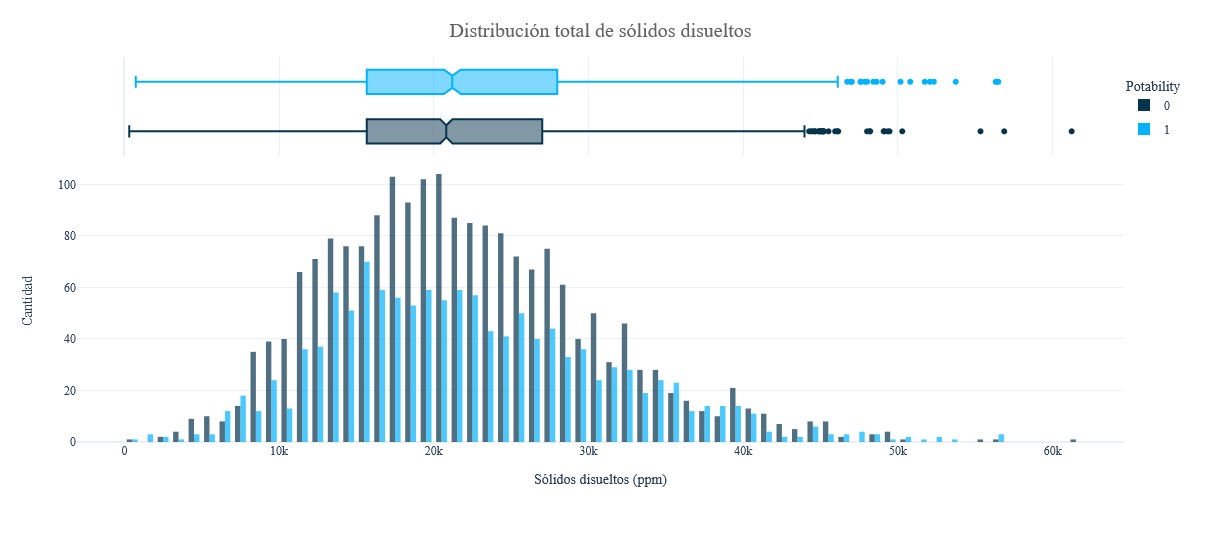
fig = px.histogram(data, x = 'Chloramines', y = Counter(data['Chloramines']), color = 'Potability', template = 'plotly_white',
                   marginal = 'box', opacity = 0.7, nbins = 100, color_discrete_sequence = [colors[0], colors[1]],
                   barmode = 'group', histfunc = 'count')
fig.add_vline(x = 4, line_width = 1, line_color = colors_dark[1], line_dash = 'dot', opacity=0.7)
fig.add_annotation(text = "< 4 ppm se considera <br> seguro para beber", x = 1.8, y = 90, showarrow = False, font_size = 13)
fig.update_layout(font_family = 'Gravitas One', title = dict(text = "Distribución de cloraminas", x = 0.53, y = 0.95,
                                                             font = dict(color = colors_dark[2], size = 20)),
                  xaxis_title_text = "Cloraminas (ppm)", yaxis_title_text = 'Cantidad', legend = dict(x = 1,
                                y = 0.96, bordercolor = colors_dark[4], borderwidth = 0,
                                tracegroupgap =5 ), bargap = 0.3,)
fig.show();
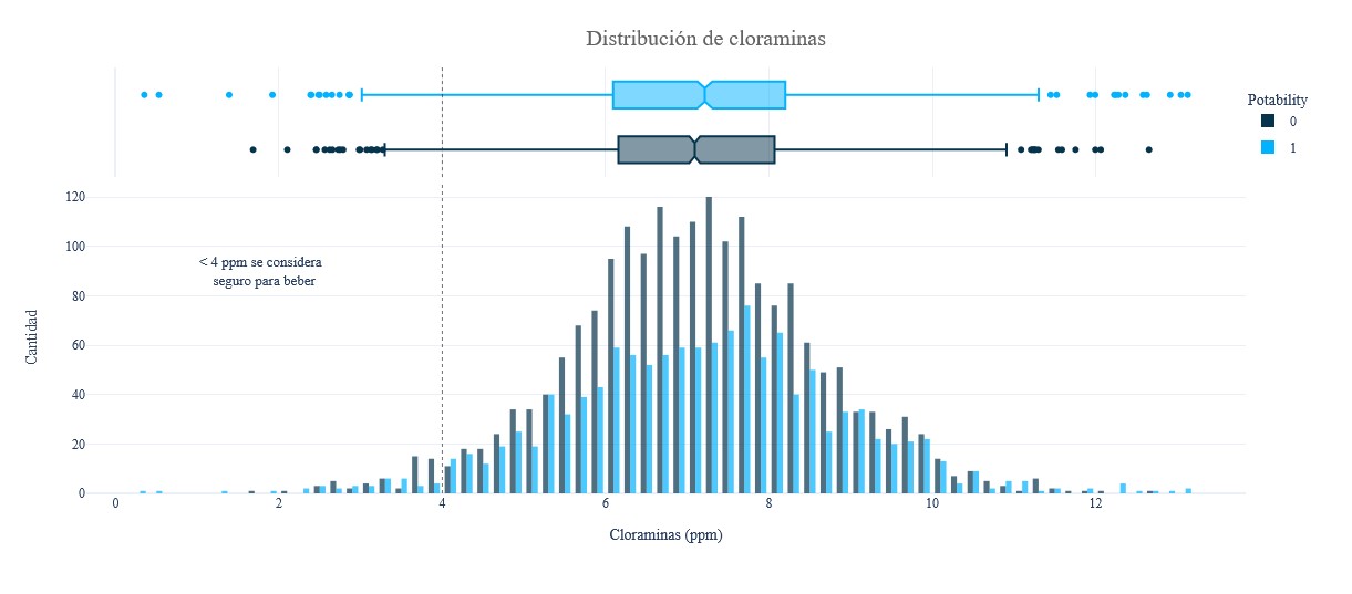
fig = px.histogram(data, x = 'Sulfate', y = Counter(data['Sulfate']), color = 'Potability', template = 'plotly_white',
                   marginal = 'box', opacity = 0.7, nbins = 100, color_discrete_sequence = [colors[0], colors[1]],
                   barmode = 'group', histfunc = 'count')
fig.add_vline(x = 250, line_width = 1, line_color = colors_dark[1], line_dash = 'dot', opacity = 0.7)
fig.add_annotation(text = "< 250 mg / L se considera seguro para beber", x = 175, y = 90, showarrow = False, font_size = 13)
fig.update_layout(font_family = 'Gravitas One', title = dict(text = "Distribución de sulfato", x = 0.53, y = 0.95,
                                                             font = dict(color = colors_dark[2], size = 20)),
                  xaxis_title_text = "Sulfato (mg / L)", yaxis_title_text = 'Cantidad', legend = dict(x = 1,
                                y = 0.96, bordercolor = colors_dark[4], borderwidth = 0, tracegroupgap = 5),
                  bargap = 0.3,)
fig.show();
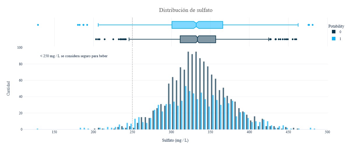
fig = px.histogram(data, x = 'Conductivity', y = Counter(data['Conductivity']), color = 'Potability', template = 'plotly_white',
                   marginal = 'box', opacity = 0.7, nbins = 100, color_discrete_sequence = [colors[0], colors[1]],
                   barmode = 'group', histfunc = 'count')
fig.add_vline(x = 400, line_width = 1, line_color = colors_dark[1], line_dash = 'dot', opacity = 0.7)
fig.add_annotation(text = "El rango de conductividad <br> es seguro (0 - 400)", x = 310, y = 90, showarrow = False, font_size = 13)
fig.update_layout(font_family = 'Gravitas One', title = dict(text = "Distribución de conductividad", x = 0.5, y = 0.95,
                                                             font = dict(color = colors_dark[2], size = 20)),
                  xaxis_title_text = "Conductividad (μS / cm)", yaxis_title_text = 'Cantidad', legend = dict(x = 1,
                                y = 0.96, bordercolor = colors_dark[4], borderwidth = 0,
                                tracegroupgap = 5), bargap = 0.3,)
fig.show();
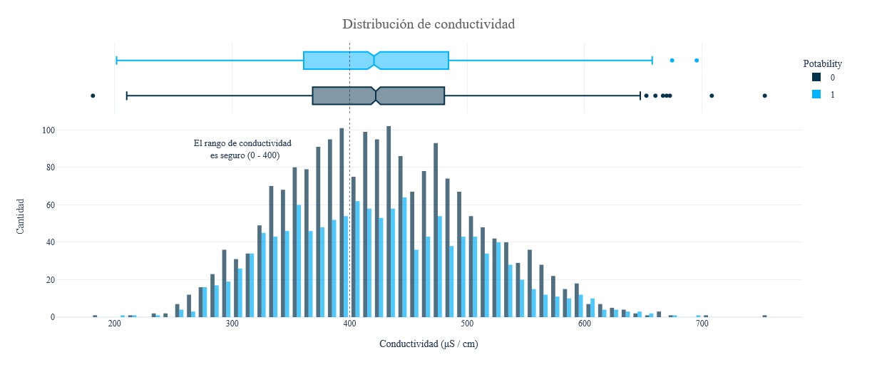
fig = px.histogram(data, x = 'Organic_carbon', y = Counter(data['Organic_carbon']), color = 'Potability', template = 'plotly_white',
                   marginal = 'box', opacity = 0.7, nbins = 100, color_discrete_sequence = [colors[0],
                                              colors[1]], barmode = 'group', histfunc = 'count')
fig.add_vline(x = 10, line_width = 1, line_color = colors_dark[1], line_dash = 'dot', opacity = 0.7)
fig.add_annotation(text = "El nivel típico de carbono orgánico es de hasta 10 ppm", x = 5.3, y = 110, showarrow = False, font_size = 13)
fig.update_layout(font_family = 'Gravitas One', title = dict(text = "Distribución de carbono orgánico",  y = 0.95,
                               font = dict(color = colors_dark[2], size = 20)),
                  xaxis_title_text = "Carbono orgánico (ppm)", yaxis_title_text = 'Cantidad', legend = dict(x = 1, y = 0.96,
                                bordercolor = colors_dark[4], borderwidth = 0, tracegroupgap = 5),
                  bargap=0.3,)
fig.show();
fig = px.histogram(data, x = 'Trihalomethanes', y = Counter(data['Trihalomethanes']), color = 'Potability', template = 'plotly_white',
                   marginal='box',opacity=0.7,nbins=100,color_discrete_sequence=[colors[0],colors[1]], barmode='group',histfunc='count')
fig.add_vline(x = 80, line_width = 1, line_color = colors_dark[1], line_dash = 'dot', opacity = 0.7)
fig.add_annotation(text = "El límite superior del nivel de trihalometanos <br> es de 80 μg / L", x = 110, y = 90,showarrow = False)
fig.update_layout(font_family = 'Gravitas One', title = dict(text = "Distribución de trihalometanos", x = 0.5, y = 0.95,
                                                             font = dict(color = colors_dark[2], size = 20)),
                  xaxis_title_text = 'Trihalometanos (μg/L)', yaxis_title_text = "Cantidad",
                  legend = dict(x = 1, y = 0.96, bordercolor = colors_dark[4], borderwidth = 0,tracegroupgap = 5), bargap=0.3,)
fig.show();
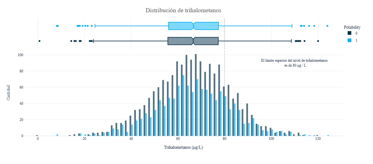
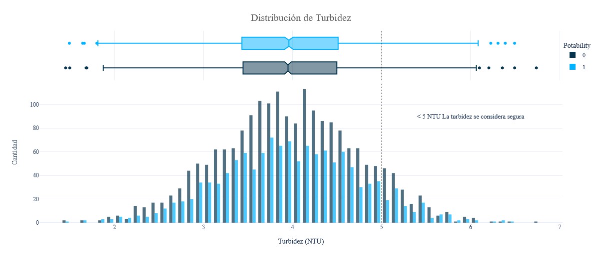
fig = px.histogram(data, x = 'Turbidity', y = Counter(data['Turbidity']), color = 'Potability', template = 'plotly_white',
                   marginal = 'box', opacity = 0.7, nbins = 100, color_discrete_sequence = [colors[0],colors[1]],
                   barmode = 'group', histfunc = 'count')
fig.add_vline(x = 5, line_width = 1, line_color = colors_dark[1], line_dash = 'dot', opacity = 0.7)
fig.add_annotation(text = "< 5 NTU La turbidez se considera segura", x = 6, y = 90, showarrow = False, font_size = 13)
fig.update_layout(font_family = 'Gravitas One', title = dict(text = "Distribución de Turbidez", x = 0.5, y = 0.95,
                                                             font = dict(color = colors_dark[2], size = 20)),
                  xaxis_title_text = 'Turbidez (NTU)', yaxis_title_text = 'Cantidad',
                  legend = dict(x = 1, y = 0.96, bordercolor = colors_dark[4], borderwidth = 0,tracegroupgap = 5),
                  bargap = 0.3,)
fig.show();
Conclusiones
Hay varias conclusiones que se pueden extraer de los pasos generales de EDA en este artículo:
- El conjunto de datos consta de 3276 filas y 10 columnas,
- Hay 9 variables con tipo de datos flotantes y 1 columna con tipo de datos categóricos,
- La variable Potabilidad se considera como una etiqueta y las demás como características,
- 3 variables contienen valores faltantes (NaN): pH, Sulfato y Trihalometanos. Por lo tanto, la imputación de datos debe realizarse en estas tres variables,
- La calidad del agua en el conjunto de datos consiste en 61% no potable (no segura para el consumo) y 39% potable (segura para el consumo),
- La mayoría de las variables tienen una correlación muy baja entre ellas, excepto las variables de dureza y pH. Por tanto, será necesario normalizar los datos,
- La distribución de la muestra de agua que no es potable es mayor que la de la potable en las variables de Trihalometanos, Conductividad y Turbidez. En la variable de sólidos casi nada,
- Todas las variables tienen datos atípicos, por lo que necesitan un manejo de valores atípicos.